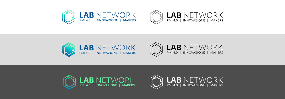
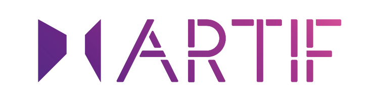
logo for Lab Network, a company that helps companies to innovate products and processes.
logo per Lab Network, un’azienda che aiuta le imprese ad innovare prodotti e processi.

logo for Lab Network, a company that helps companies to innovate products and processes.
logo per Lab Network, un’azienda che aiuta le imprese ad innovare prodotti e processi.
<td “>Logo
| NAME | |
| CLIENT | Lab Network |
| YEAR | 2018 |
| TYPE | Graphic |
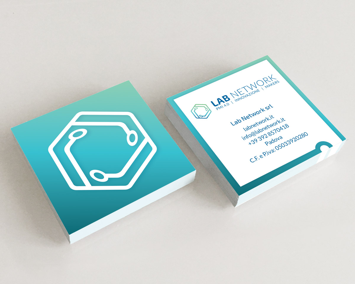
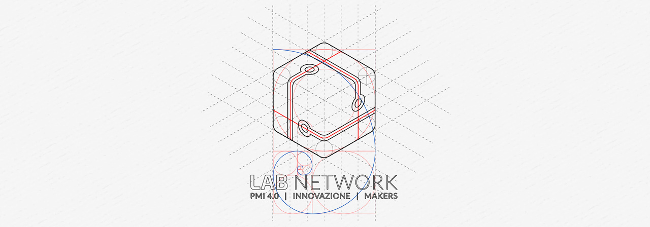
The logo was conceived to express concepts of connection, technology, avant-garde and inventive but also of contacts, communication and team.
Il logo è stato concepito per esprimere concetti di connessione tecnologia, avanguardia e inventiva ma anche di contatti, comunicazione e squadra.
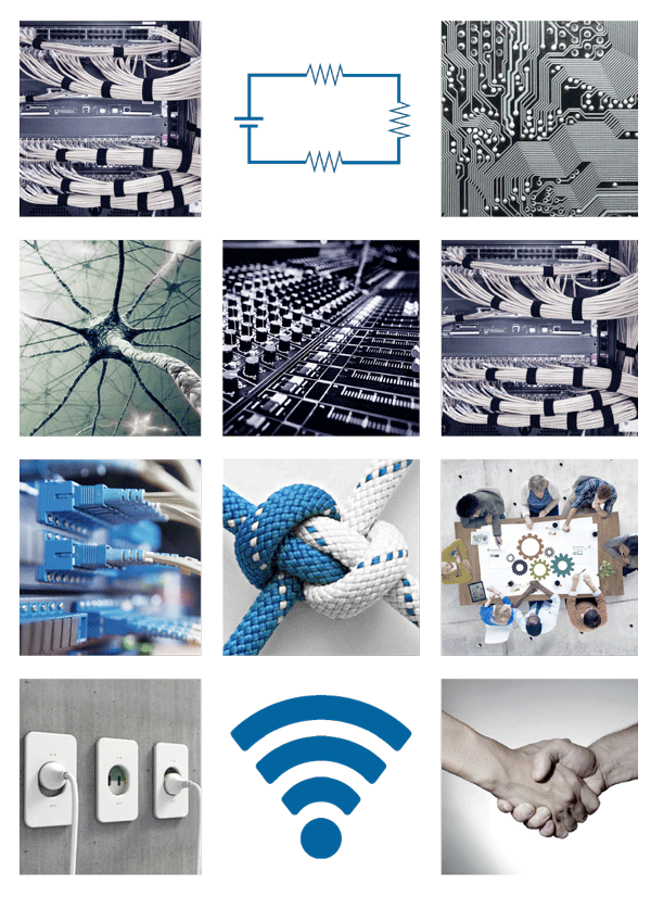
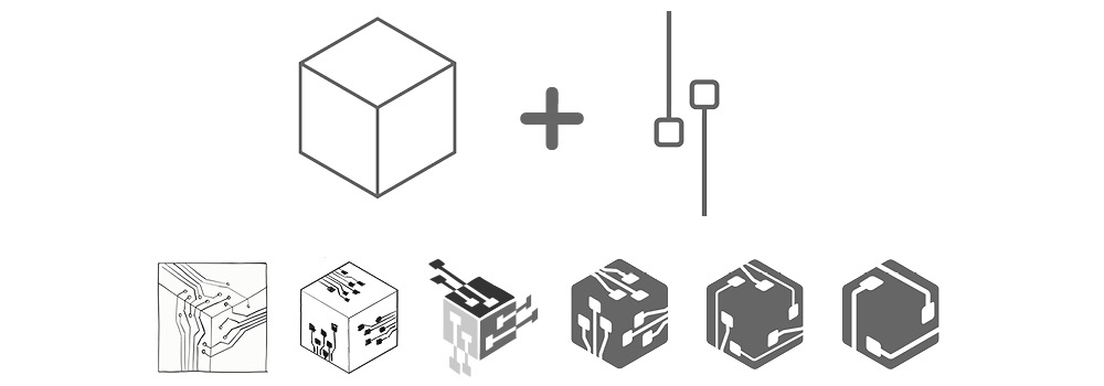
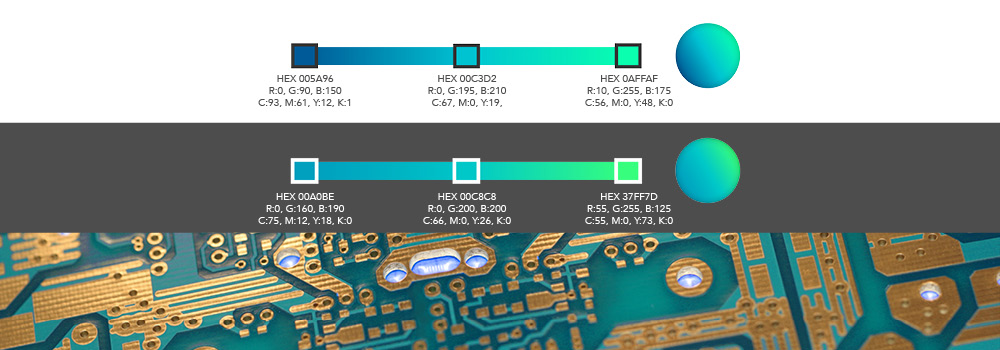
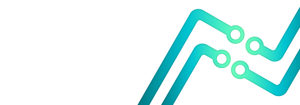
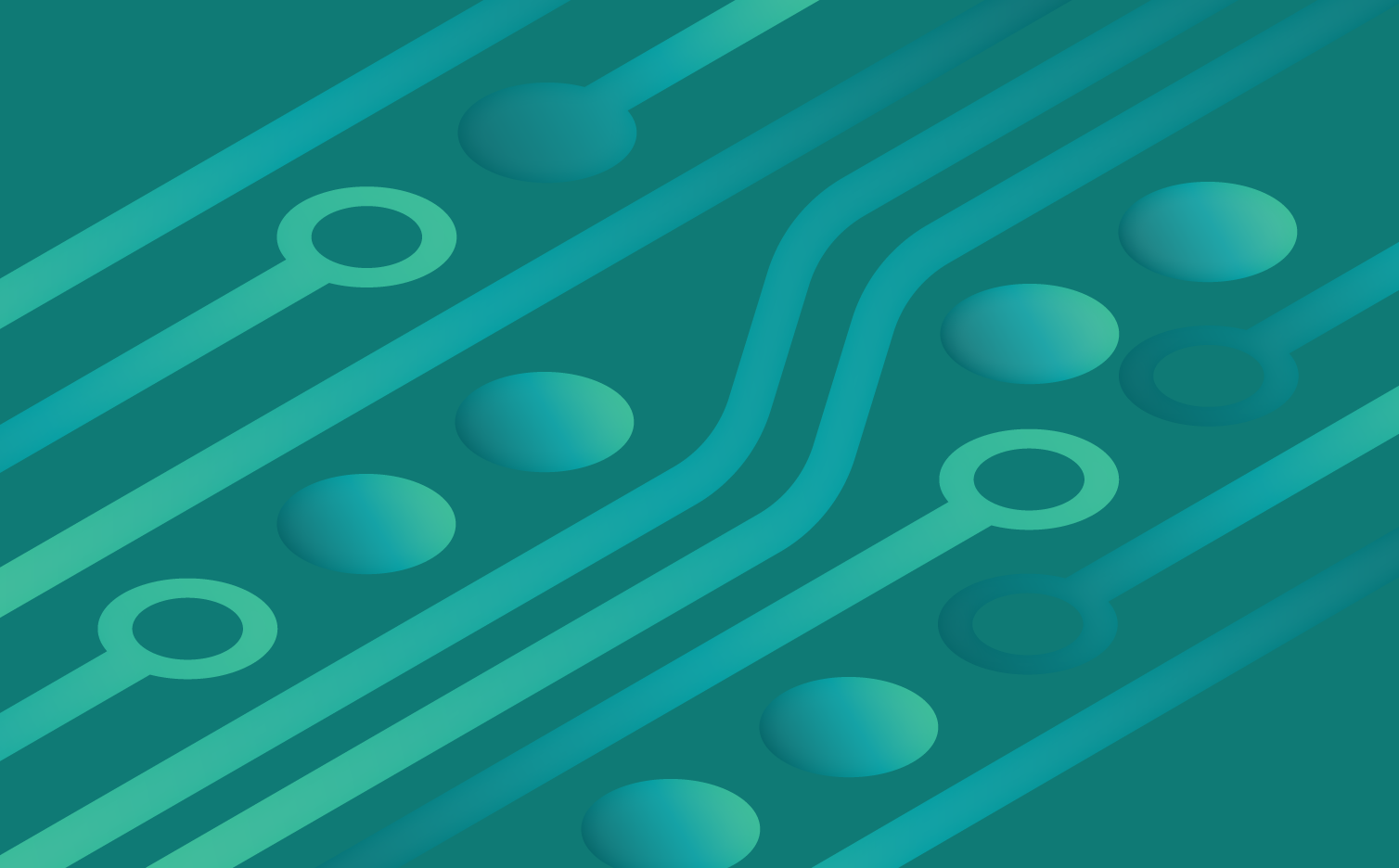
The elements that compose it are the cube, the starting point of the original FAB LAB logo and symbol of solidity and concreteness, and the electrical circuits of the cards widely used in the electronic world.
The pictogram is in fact identified by a cube in axonometry, enclosed in a hexagon, in which in each of the three visible faces appears an electrical circuit connected to an electrode in the adjacent face, to recall the concept of interactivity and inter-relationship between different disciplines and professionals.
Gli elementi che lo compongono sono il cubo, il punto di partenza del logo originale FAB LAB e simbolo di solidità e concretezza, e i circuiti elettrici delle carte ampiamente utilizzati nel mondo elettronico.
Il pittogramma è infatti identificato da un cubo in assonometria, racchiuso in un esagono, nel quale in ognuna delle tre facce visibili appare un cicruito elettrico collegato ad un elettrodo nella faccia adiacente per richiamare il concetto di interattività e interrelazione tra diverse discipline e professionisti
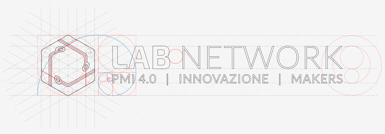
The naming of the logo is composed by two fonts and two different styles, to create contrast and originalit, well distinguishable and legible. Able to attract and adapt to the aesthetic expectations of the public to which it refers trying to bring the corporate message.
The hierarchy was created by taking the word LAB to want to represent a solid but welcoming base, always present, something full-bodied but with rounded corners representing a physical base and a place in which to experiment the forms, in contrast with NETWORK, thin and precise edges to express order, balance and represent the functional concept of connection as if they were the threads of a net.
The fonts used are Exo2 bolt for the word LAB and Lato light for the word Network and the subtitle.
The colors recall the green of the electronic boards and the blue, typically used for concepts of balance and connection, in a blend that goes from electric blue to acid green to remind the led of lighting and operation of electronic equipment.
Per la denominazione del logo è stato deciso per due tipi di carattere e due stili diversi, per creare un contrasto e rendere la denominazione originale, ben distinguibile e leggibile. In grado di attrarre e adattarsi alle aspettative estetiche del pubblico a cui si riferisce cercando di portare il messaggio aziendale.
La gerarchia è stata creata prendendo la parola LAB per voler rappresentare una base solida ma accogliente, sempre presente, qualcosa di corposo ma con angoli arrotondati che rappresentano una base fisica e un luogo in cui sperimentare le forme, in contrasto con NETWORK, sottile e bordi precisi per esprimere l’ordine, bilanciare e rappresentare il concetto funzionale di connessione come se fossero i fili di una rete.
I font utilizzati sono Exo2 bolt per la parola LAB e Lato light per la parola Network e il sottotitolo.
I colori richiamano il verde delle schede elettroniche e del blu, tipicamente utilizzato per i concetti di bilanciamento e connessione, in una miscela che va dal blu elettrico al verde acido per ricordare i led dell’illuminazione e del funzionamento delle apparecchiature elettroniche.